
Establishing a design culture and rebuilding the component library
Overview
OTORIO is an OT security platform, later acquired by Armis for $120M in 2025.
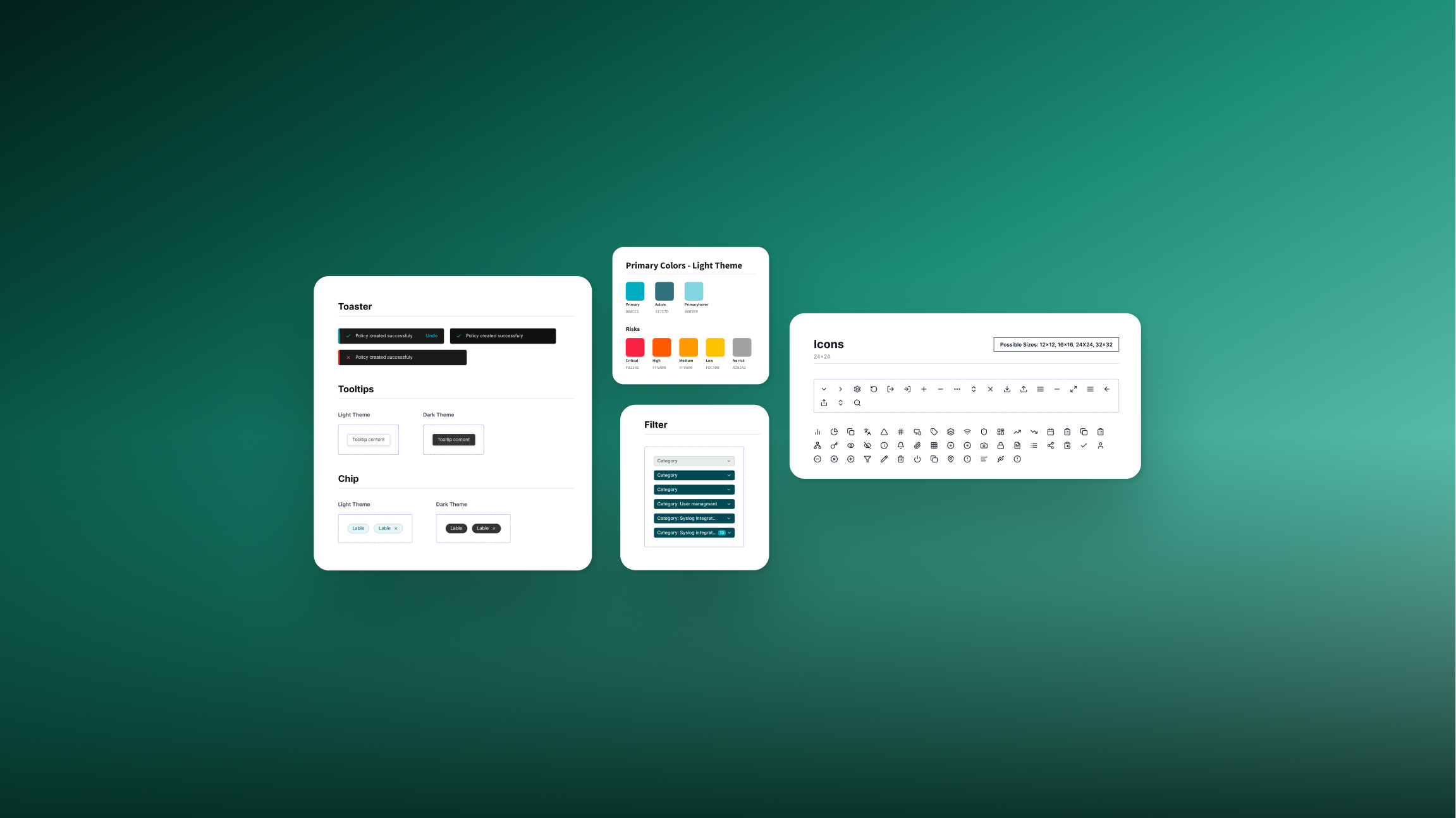
I built the design system end-to-end — migrating from Sketch to Figma, rebuilding the component library, and establishing a shared workflow across design, product, and R&D.
PROBLEM
Design was a bottleneck. Every delivery required multiple QA rounds, updates had to be made twice across two tools, and developers had no reliable source to work from.
- Duplicate fonts and components — no one knew which was correct
- Sketch files PMs couldn't open — required constant sync meetings
- Designers working across three tools simultaneously slowed every delivery
- Zeplin updates caused discrepancies with stories, adding QA overhead
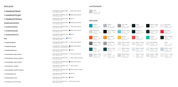
40 different font styles and 36 colors
No one knew which was the original, no naming convention, no hierarchy.
The Process
Gaps before components
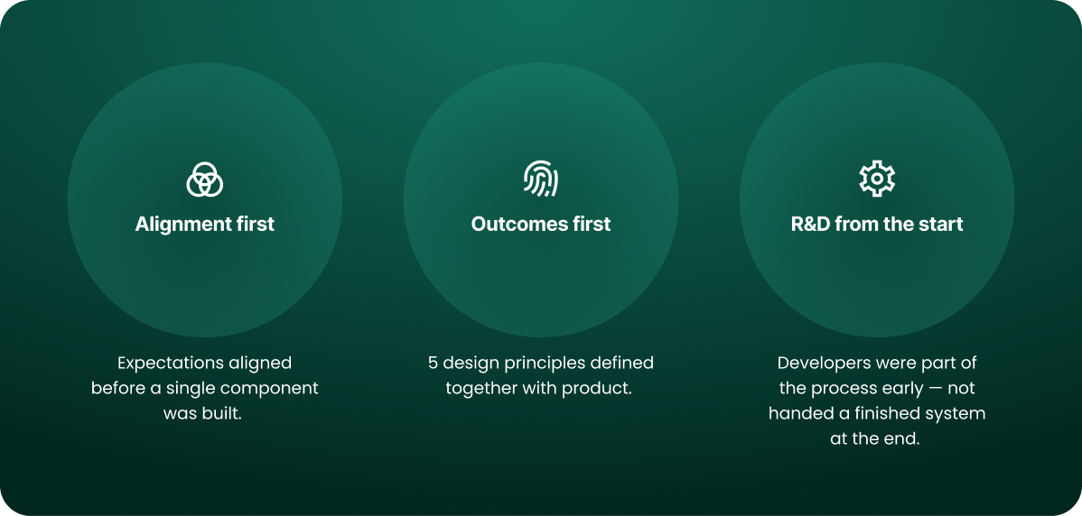
Mapped what was broken before deciding where to start — then prioritized by usage and validated with R&D before each rollout.

The Approach
From gaps to rollout
Mapped what was broken before deciding where to start — then prioritized by usage and validated with R&D before each rollout. Beyond the components, I built a workflow guide and a Figma training for R&D — so developers understood the why behind decisions, not just how to implement them.


The Design
Colors & Typography
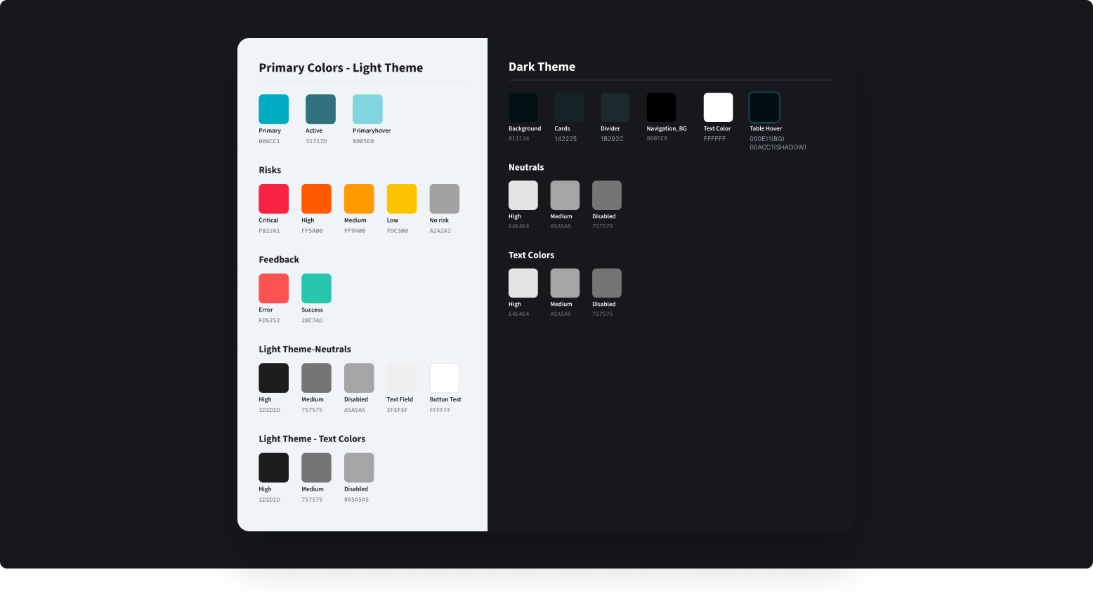
A dedicated Risk palette for security severity — Critical, High, Medium, Low, No Risk. One font family across all levels, consistent scale.

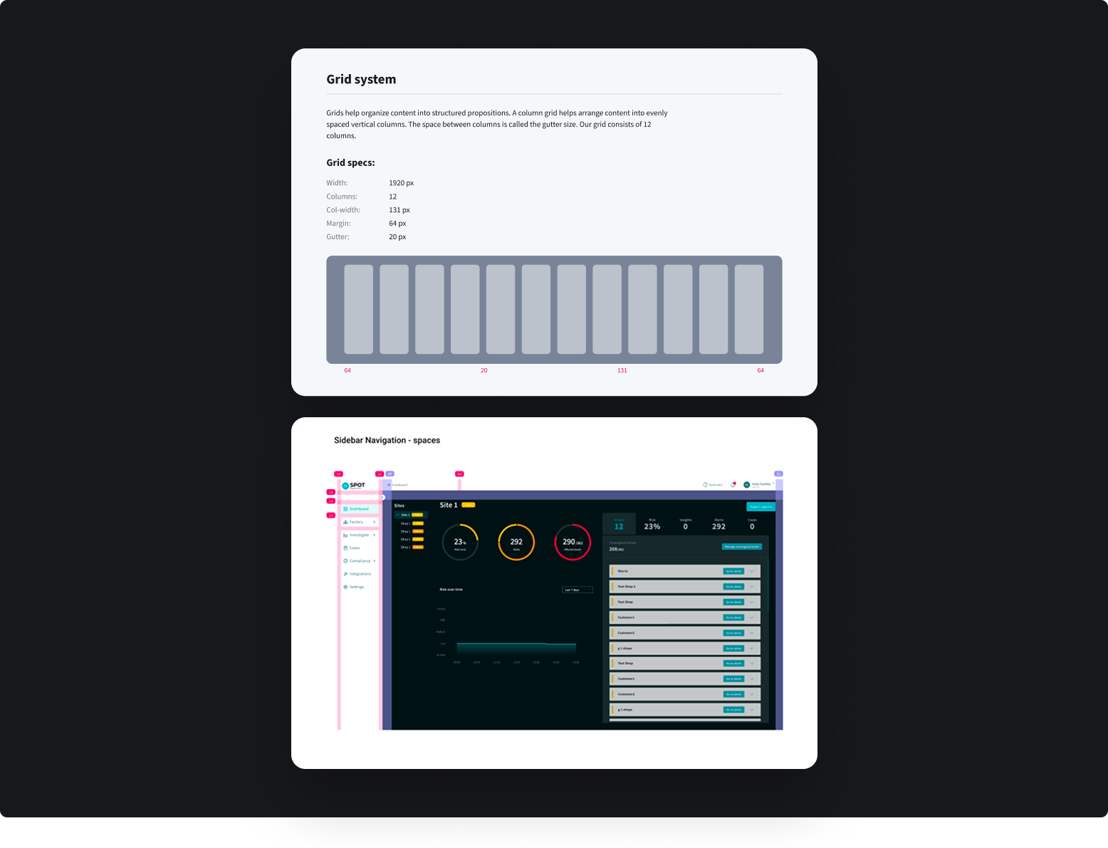
Grid
12-column grid at 1920px, 64px margins, 20px gutters. Applied directly to the OTORIO dashboard — the grid isn't theoretical, it's how the product is laid out.
Component guidelines
Every component variation documented — planned as Storybook guidelines so R&D could implement independently.
Design Principles
5 principles to help the team make decisions without escalating to design.
- Focus - Minimize irrelevant data, provide smart defaults, keep the experience simple.
- Consistency - Familiar patterns, standard icons, uniform terminology - reduce, reuse, don't redesign.
- Efficiency - Build infrastructures, not islands of features.
- Progressive complexity - Simple flows for new users, advanced options for experienced ones.
- Meaningful copy - Users should always know what will happen before they click.

IMPACT
"I understand what to do from Figma, so I don't need to ask you any questions."
After 4 months, the system became a single source of truth. When the product went through a rebrand, updating it was straightforward — the system absorbed the change instead of fighting it.
WHAT I LEARNED
Getting people invested in the system was as important as building it.
The components were the output — the real work was convincing people it was worth doing, understanding what each stakeholder needed from it, and building enough trust that they'd actually use it.
Migrating to Storybook was on the roadmap — and a conscious decision to stop at Figma. The system needed time to stabilize before adding more tooling. Getting developers to trust one source of truth was already a significant shift.
