
Redesigning how security teams understand and act on risk
Overview
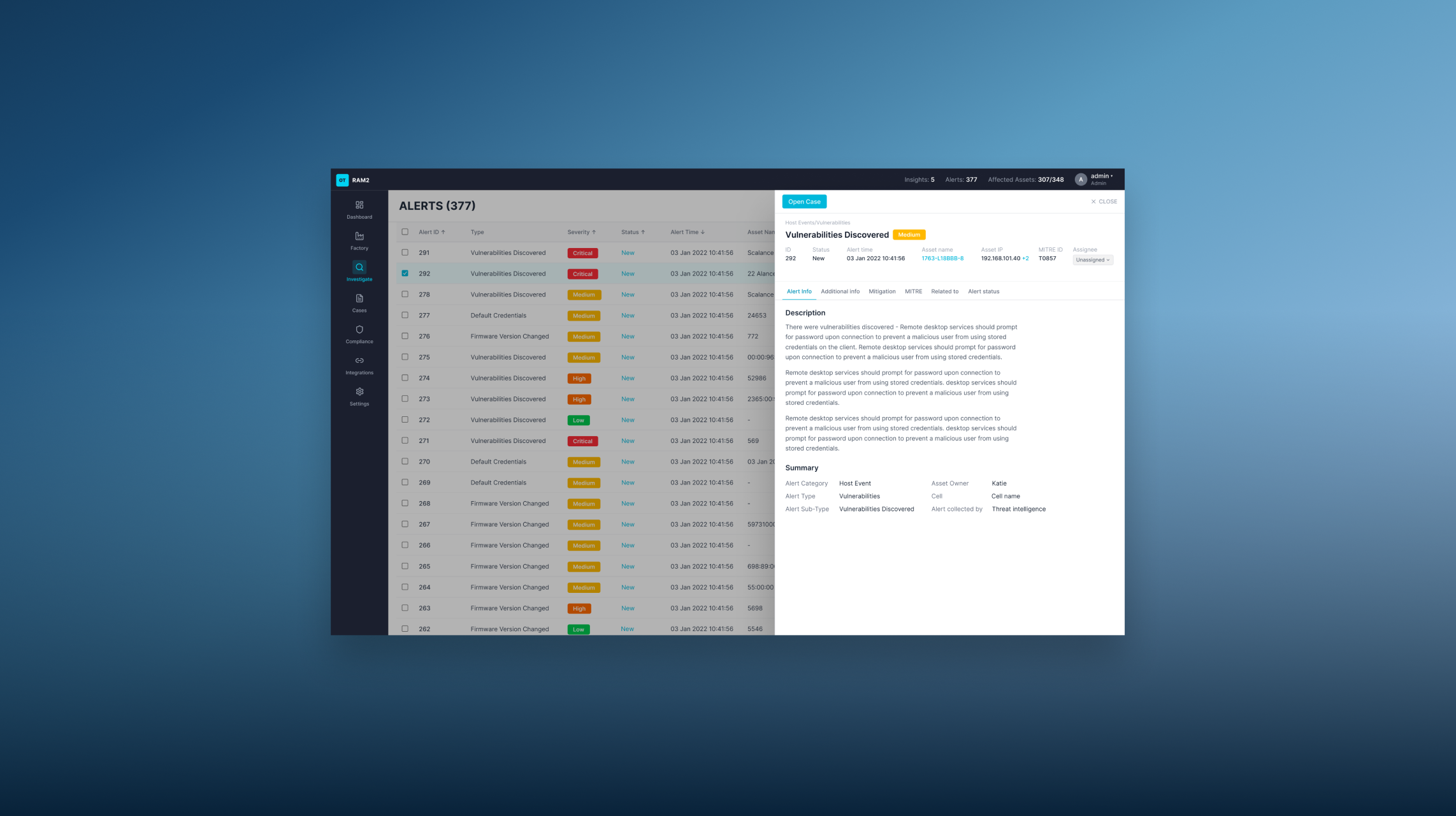
OTORIO is an OT security platform, later acquired by Armis for $120M in 2025. I joined the design team under a senior designer, and when he left, I became the senior designer on the product - designing the core investigation surfaces: Assets, Alerts, Cases, and Rules — across two years.
PROBLEM
OT security platforms deal with enormous amounts of data: assets, alerts, vulnerabilities, insights, cases. The challenge isn't collecting the data — it's making it actionable.
Users, security analysts and operations managers — were drowning in information with no clear path to action.
- Risk scores appeared everywhere with no explanation behind them
- Navigation between screens broke the investigation flow
- Terminology was inconsistent across the product and in external messaging
- Different user types needed different things from the same data
The Process
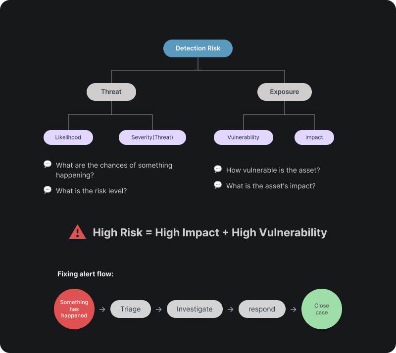
Risk as the backbone
Every area of the platform connects back to one question: what's the actual risk, and what do I do about it? Before designing any screen, I mapped how users moved from detection to action.
Roadmap and requirements
Beyond the design brief - I worked with Sales, CS, and Marketing to map customer understanding gaps, wrote the product requirements for Cases myself, and joined VP-level roadmap planning.

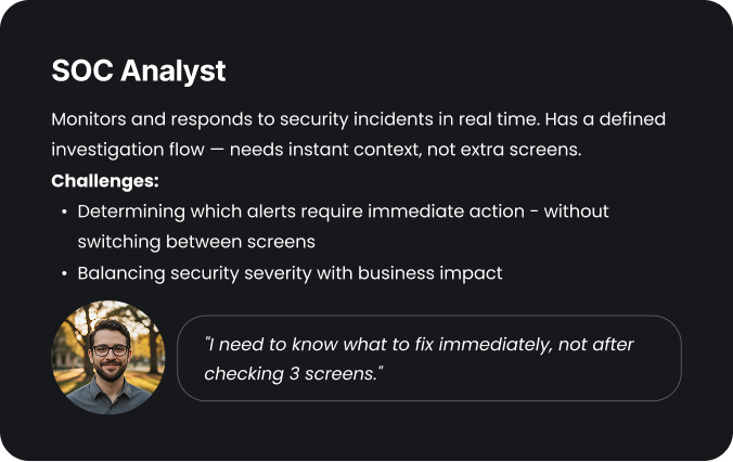
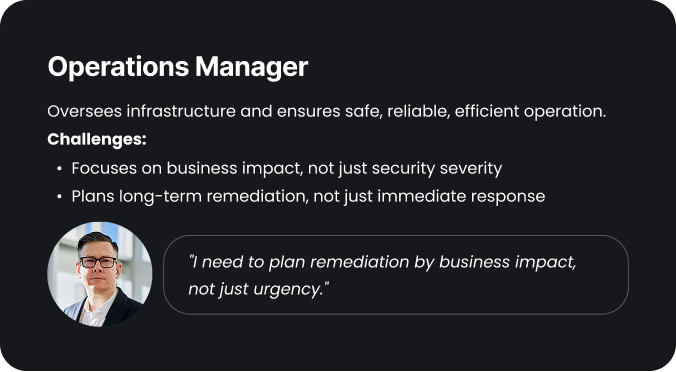
The Users
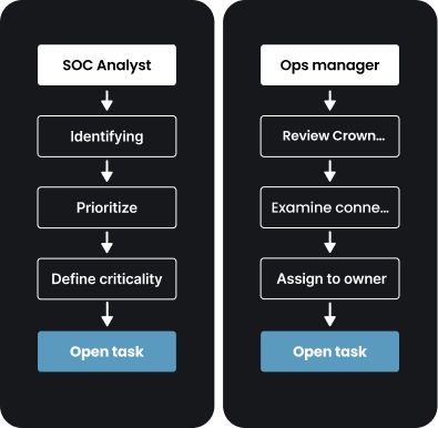
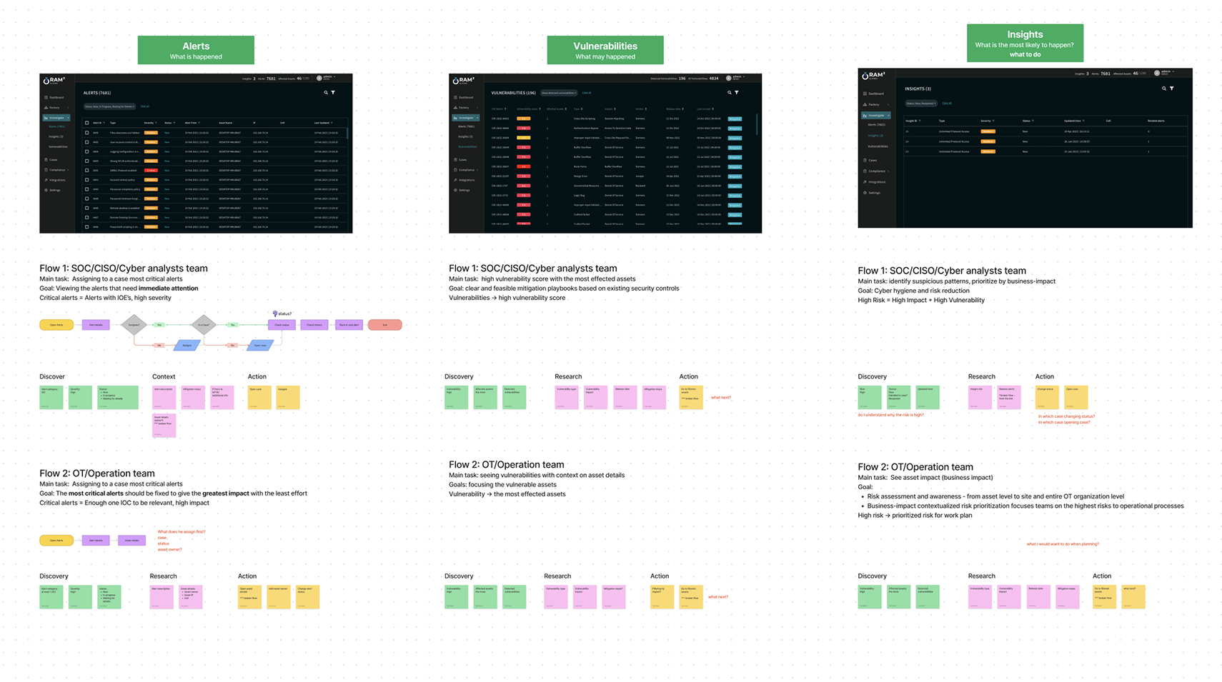
Each of these screens serves two different investigation paths
Mapping both flows per screen showed where users got stuck — and where the system could shift from reactive to proactive.
The Approach
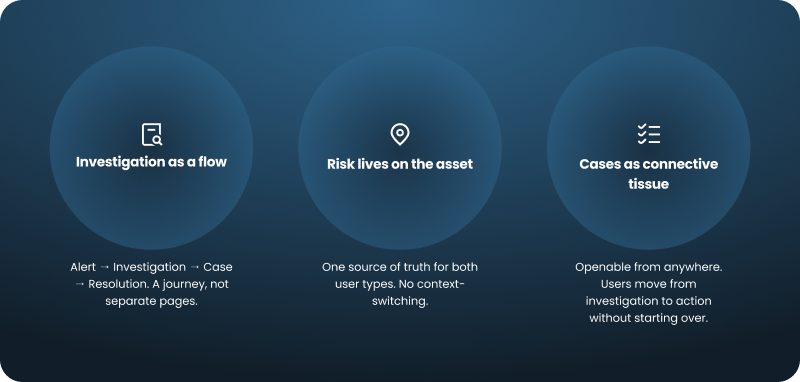
The product had a lot of screens. Every decision came back to one question: does this keep the investigation moving, or does it stop it?
The Design
From row to panel
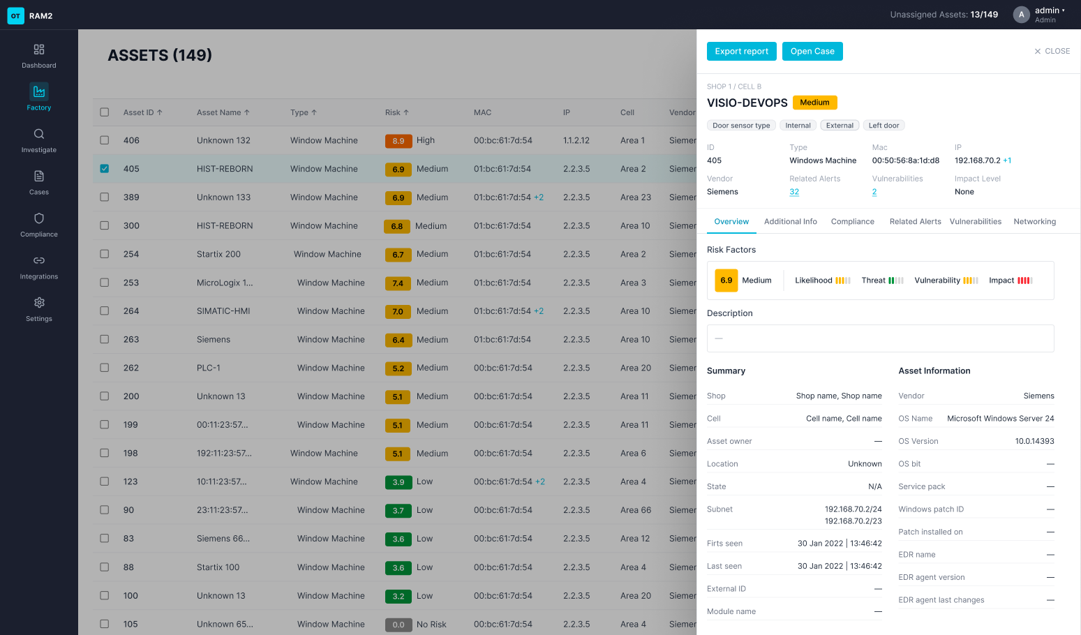
Asset details used to open inside the row — no room for the data, no context for the investigation. Moving to a side panel meant details stay visible alongside the table, and the design scales as the product adds information.
Priority first
Alerts pull from multiple sources — a lot landing in one place. Close collaboration with the research team mapped the actual investigation order: what analysts look at first, and in what order. Priority information is immediately visible; details expand without overwhelming.
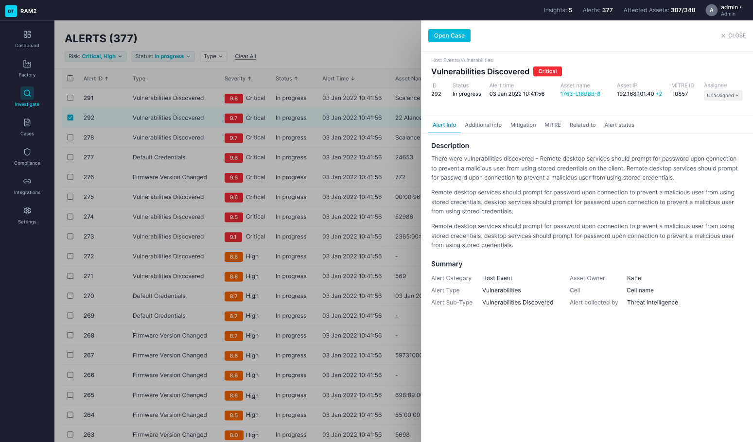
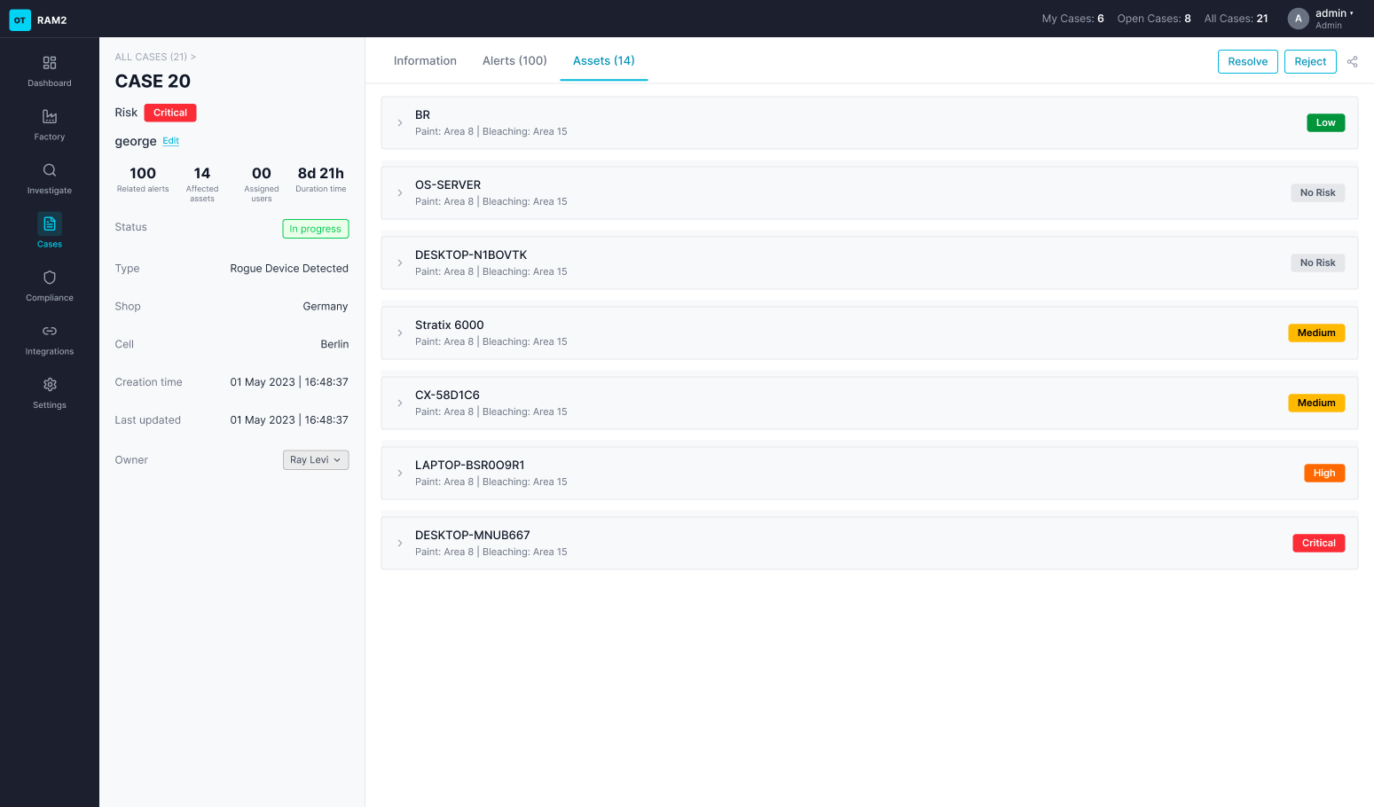
Cases openable from anywhere
There was no way to open a case from within an alert or asset — users had to navigate out and start over. Cases are now openable from anywhere in the flow: new case or add to existing, with a clear definition of what belongs there.

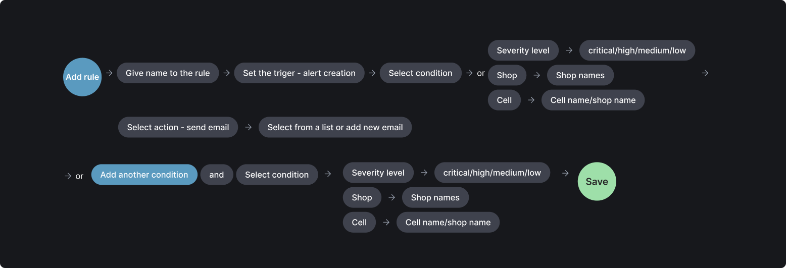
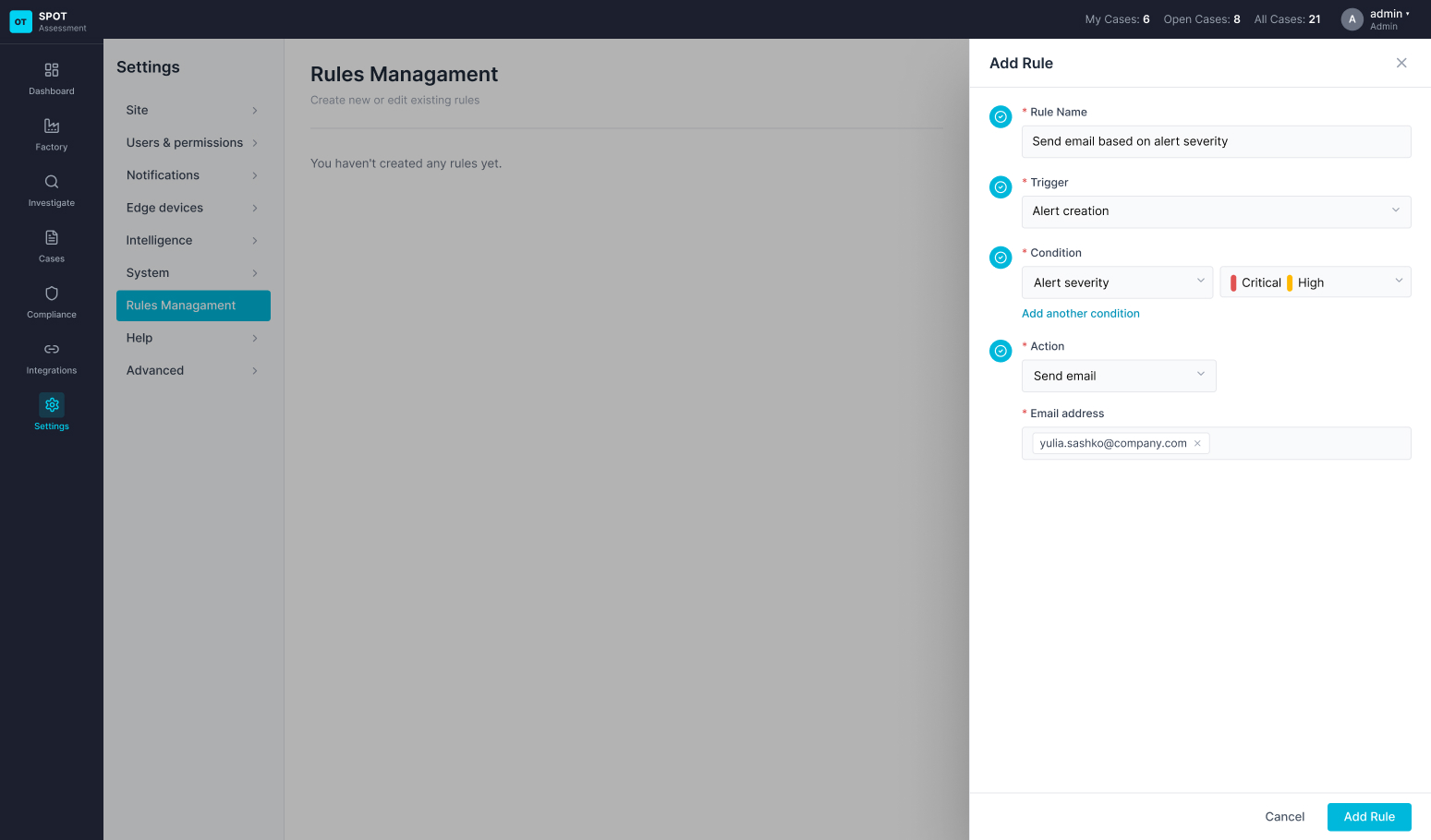
Rules: first version, full logic
Rules didn't exist in the system. I designed the first version from scratch — including the logic: what triggers a rule, what conditions apply, what action follows.
IMPACT
After two years, the product had a coherent investigation flow from end to end - analysts filed fewer support tickets and had fewer clarifying questions about how to read risk data.
This work was part of a broader product effort that helped close a key enterprise deal. In 2025, OTORIO was acquired by Armis for $120M.
WHAT I LEARNED
The hardest part of designing a complex security product isn't the UI — it's building shared understanding across engineering, product, sales, and users about what the product is actually solving.
The most valuable thing I did wasn't designing a screen. It was mapping the flow first.
