Persona
SOC Analyst
Monitors and responds to security incidents in real time.
"I need to know what to fix immediately, not after checking 3 screens."
OTORIO / OT Security Platform
Designing the core investigation experience across Assets, Alerts, Cases, and Rules.
OTORIO, later acquired by Armis in 2025.
My work spanned understanding user workflows, defining requirements, interaction design, UI, and collaboration with engineering. I joined the design team as a Product Designer and became the primary designer for the product after the senior designer left.
OT security platforms deal with enormous amounts of data: assets, alerts, vulnerabilities, insights, cases.
Move between related information and take action without losing the investigation context.
Two user types
Monitors and responds to security incidents in real time.
"I need to know what to fix immediately, not after checking 3 screens."

Oversees infrastructure and ensures safe, reliable, efficient operation.
"I need to plan remediation by business impact, not just urgency."
I uncovered that customers didn't understand the full picture, or weren't using the product the way we intended, so they weren't getting its full value. We knew the product served two user types, but we didn't fully understand how each worked within the system. I went to talk with users and worked with Research to understand how they investigate an incident.
I mapped how users move from detection to investigation to action, using risk as the thread connecting the product.
A journey, not separate pages.
One source of truth for both user types. No context-switching.
Openable from anywhere. Users move from investigation to action without starting over.
How risk is built
Risk is made of the threat and the asset's exposure.
High Risk = High Impact + High Vulnerability
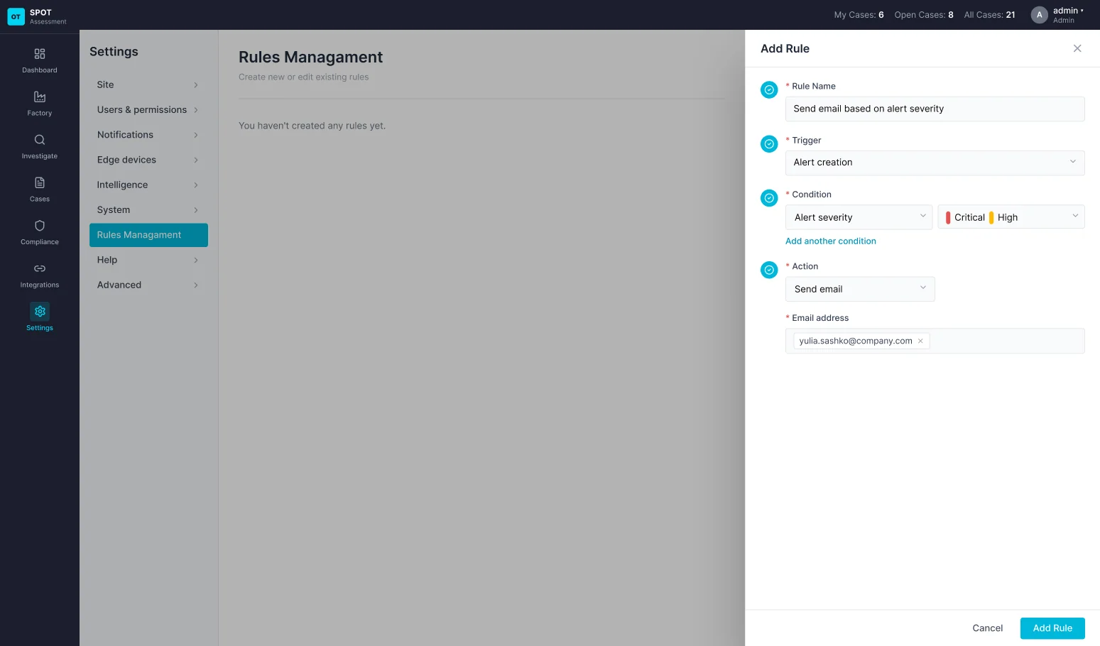
A rule defines what happens when an alert is created: which conditions it must meet, and which action follows.
Rules didn't exist in the product.
We first had to identify the foundation the feature could build on. I designed the first version from the ground up: a rule sends an email, built from a trigger, conditions and an action.
So users can understand what would trigger a rule, which conditions applied, and what would happen next.
Add rule flow
and Add another condition, with the same options
Before defining the final interface, I worked through dependencies and system behavior.
The Cases page was sparse: no asset details, no way to add information to a case, and duplicate cases could appear when opening one.
I chose where the button lives so it is reachable from the investigation, defined what the system asks when a case is opened, added options at creation such as linking a site and assets, redesigned the case page to carry that information, and made duplicates recognizable to the user.
I designed the case as part of the investigation flow, rather than a separate destination.
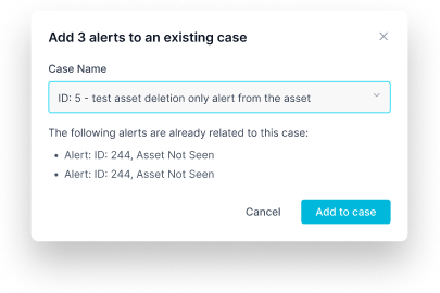
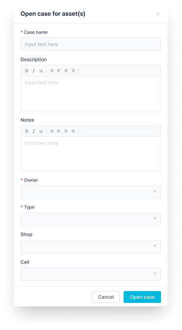
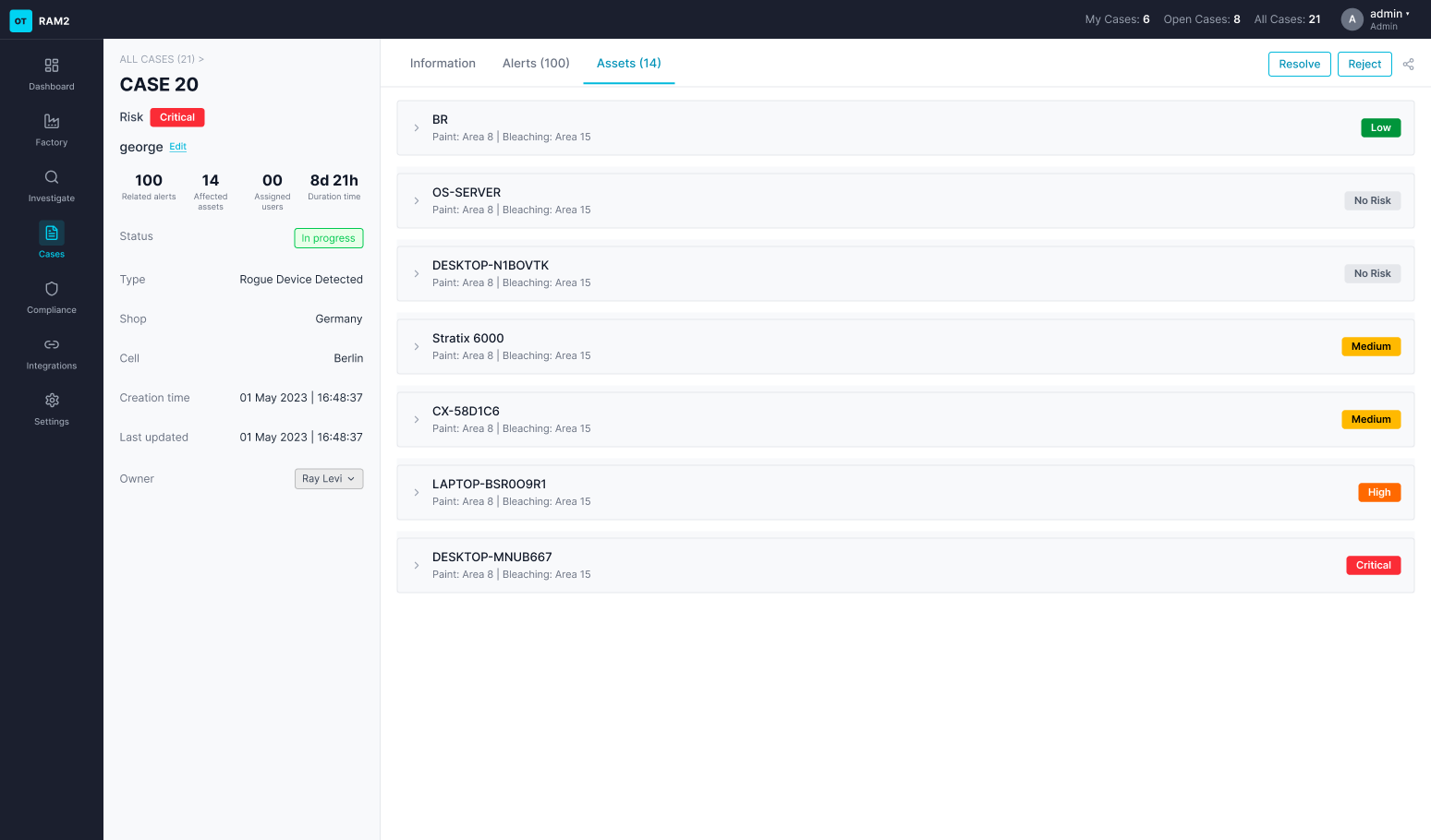
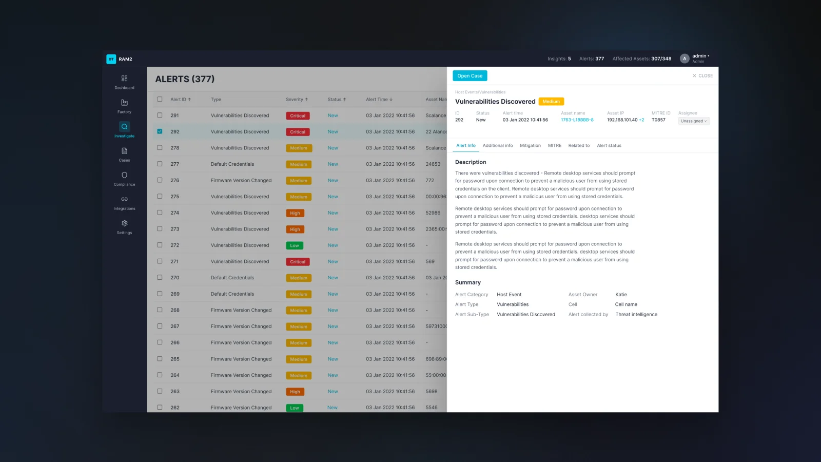
Asset and alert details opened inside the table row, leaving little room for information and forcing users to lose context when investigating.
I explored three directions: an expandable table row, a side panel, and a full page. I moved asset and alert details into a side panel, keeping the table and investigation context visible while allowing the detail view to grow with the product.
The side panel supported the way analysts moved between overview and deeper investigation without repeatedly navigating away from the main list.
Where they differ: risk lives on the asset.
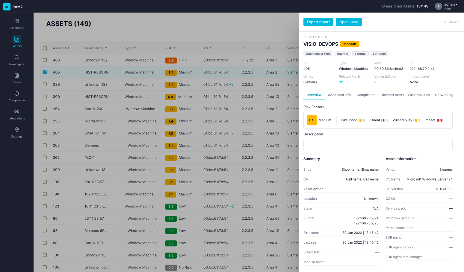
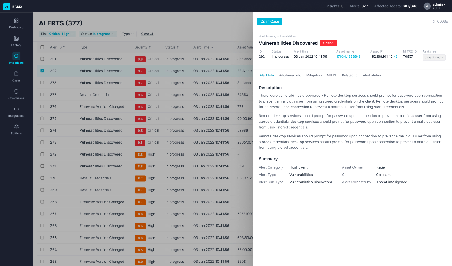
Rules let alerts trigger an email automatically, and users can now open a case quickly from any alert or asset, moving from investigation to action without starting over. Both were developed and shipped, Rules as a first version.
Sales, who are in frequent contact with customers, navigated a prototype I built and completed the task, and reported that it made the task easier. The VP Product's feedback was positive.
The product team gained an understanding of how the product's parts connect, and Research were aligned that the design improved the flow of an incident and its analysis. The business impact of risk also became easier to understand.
The research showed two stories, handling what is urgent now and the business story, and with them a need for a separate business-side area. We started planning it, but it was not ready.
In a complex security product, that means building the understanding across users, Product, Engineering, and the business.
It helped me make better interaction decisions and keep the experience coherent as the product grew.